The designer page shows all formerly added (or recognized) interactive fields on the documents and allows to interactively place additional interactive fields.
The Designer screen is showing following elements:
- Standard menu bar
on the very left side, by default collapsed.
Menu items have been explained in the first chapters of the Application Reference - WebUI. - The Recipients List
- The elements toolbox with
- Form Field Elements
- Predefined (static value) Fields
- The main editor
- The page preview section
(on the right side) - Properties Panel
to configure element properties; visible only when an element is selected and in property-editor mode. - Wizard Navigation Bar (bottom)
UI Areas of the Designer explained in Detail
In this chapter, we are explaining the UI elements and their behavior in detail. We are not covering
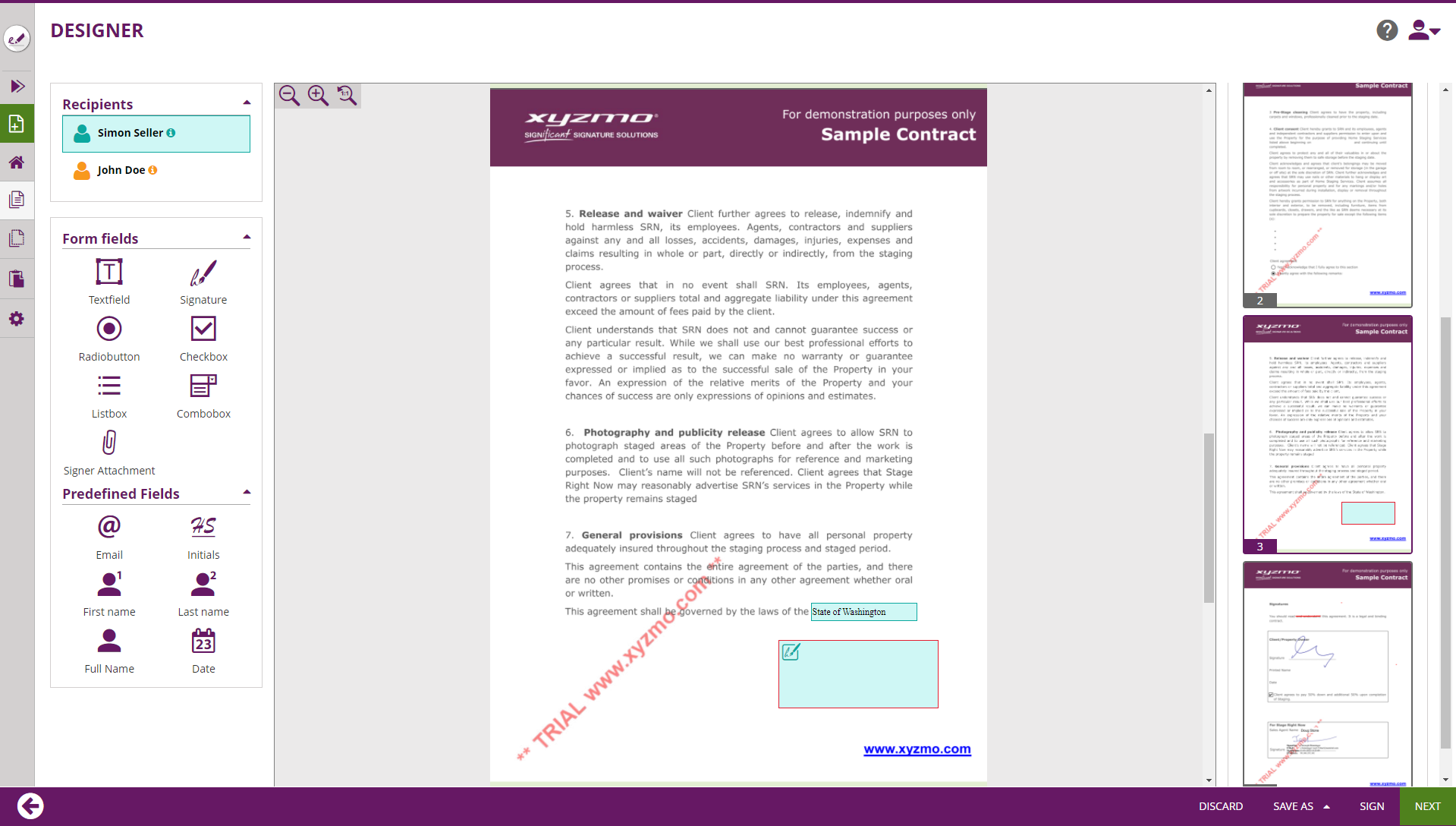
Recipients List
Shows the list of all recipients and automatic-signature activities.
Allows to select to which recipient elements that are added later-on are assigned, and can be used to re-assign the element currently selected in the Main Editor.
Elements Toolbox
Form Field Elements
Predefined (static value) Fields
Main Editor
WYSIWYG-Editor to place form elements, re-arrange and resize them.
Page Preview
Shows the structure of documents and their pages contained in the envelope, and previews locations of signature fields on the document.
Properties Panel
On devices without touch capabilities, the user can open the properties panel by selecting (clicking) an element in the Main Editor area. On tablet PCs (or in general on devices with touch input), the user must click on the cogwheel icon on an element's adhoc menu to open the properties panel. When the properties panel is open, the user can change settings, but needs to confirm or cancel the properties panel before other UI changes (e.g. arranging of elements) can be done in the UI.
Wizard Navigation Bar
The navigation control of the wizard, with following buttons while on the Designer Page:
- Arrow-Back, navigates to the recipients page
- Discard, which deletes (after confirmation dialog) the draft
- Save-As
- Template, allowing to create a new Template based on the data configured for the Draft
- Draft, persisting the changes made on the draft and returning back to the Envelope Filter View.
- Sign-Button, visible and accessible only when the first signer of an envelope is the sender
- Next-Button, proceeds to the Summary Page
Element Properties
Let's have a deeper look into the properties of the elements which you can place using the Designer Page. When an element was placed on a document, and the element gets selected, the properties panel gets opened. Within the properties panel, different properties of the element can be defined. The properties which can be defined vary between different element types.
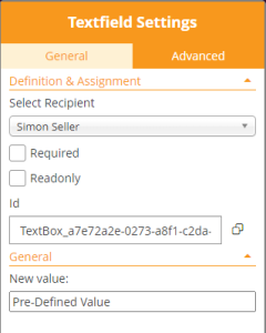
Properties of Textfield Elements
General Settings
Advanced Settings
The "Advanced" tab contains Text & Appearance configuration and several options of the Textfield.
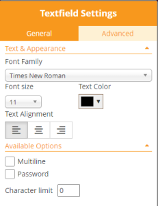
In the Text & Appearance section, the sender can define
- Font Family
- Font size
- Text color
- Text Alignment
The font family defines which font should be used for rendering the text in the web browser, and also be used for filling form elements in the PDF. Keep in mind when working with languages that require usage of Unicode characters, that the font installed on the server must also support the entire (used) unicode charset - otherwise the entire text or some characters will be represented using replacement characters.
In the "Available Options" section, the sender can define
- that a text field is accepting multiline input
- that the field behaves as a password field, which implies that the value entered by the recipient (or prefilled) is not readable but showing masked password input instead
- Define a maximum text input length (character limit)
Properties of Signature Elements
General Settings
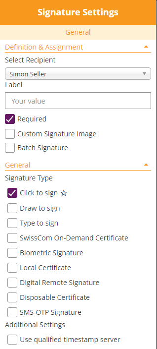
The "Definition & Assignment" section behaves like defined in the standard behavior of all elements, but with following deviations:
- Signature fields can be assigned also to "Automatic Signing Activities", making the automatic signatures visible on the document
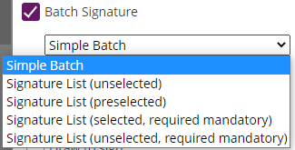
- A "Batch Signature" option is added
With the "Batch Signature" checkbox enabled, it makes the signature field a member of a batch of several signature fields. Signatures being member of a batch can be signed all at once if the signer prefers, but allow the signer also to sign them one by one. When the batch signing option is enabled, the sender can distinguish between different batch signing behavior:
- Simple Batch
where the signer just knows how many signature fields are signed as part of the batch - Signature List (unselected)
where a list of all signature fields (document name and page number, or signature field label) are displayed in a list of checkboxes; the user needs to select those which should be signed as part of the batch (opt-in) - Signature List (preselected)
where a list of all signature fields (document name and page number, or signature field label) are displayed in a list of checkboxes; the user needs can deselect those which he doesn't want to sign as part of the batch (opt-out) - Signature List (selected, required mandatory)
Like "preselected", but without an option to uncheck the "mandatory signature fields) - Signature List (unselected, required mandatory)
Like "unselected", but mandators signature fields still preselected and without an option to uncheck the "mandatory signature fields
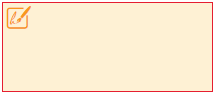
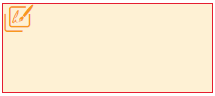
The signature field, in the designer page's main editor, is represented by a different icon when the signature field is member of a batch:
| Signature Field in standard representation | Signature Field allowing batch signing |
|---|---|
|
|
In the "General" section, the signer can select the signature type(s) he wants to allow for the signer. The different signature types are explained in detail in the Electronic Signature Guide (sender perspective). Also, the Signer Guide describes the different user experience from signer's perspective.
If the sender allows just one signature type, the signature type will be automatically selected when a recipient later-on clicks on the signature field. When allowing multiple signature types, the sender is allowing the recipient to select one of the allowed signature types. The sender can in addition define, by marking the "star" icon (), a preferred signature type which is then automatically preselected for the recipient.
In addition, the sender can define if a timestamp of a timestamping service will be embedded on the signature directly.
The (RFC 3161 compliant) timestamp service therefore has to be configured in the server configuration. It depends on server configuration, if a qualified timestamp service will be used therefore.