...
| Section | ||||||||||||||
|---|---|---|---|---|---|---|---|---|---|---|---|---|---|---|
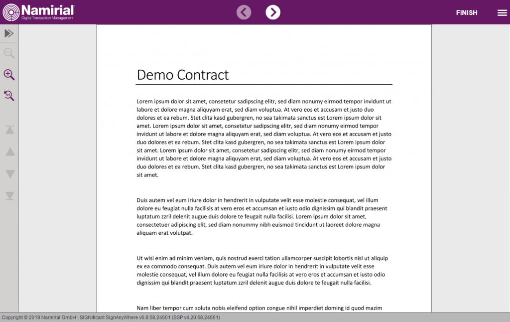
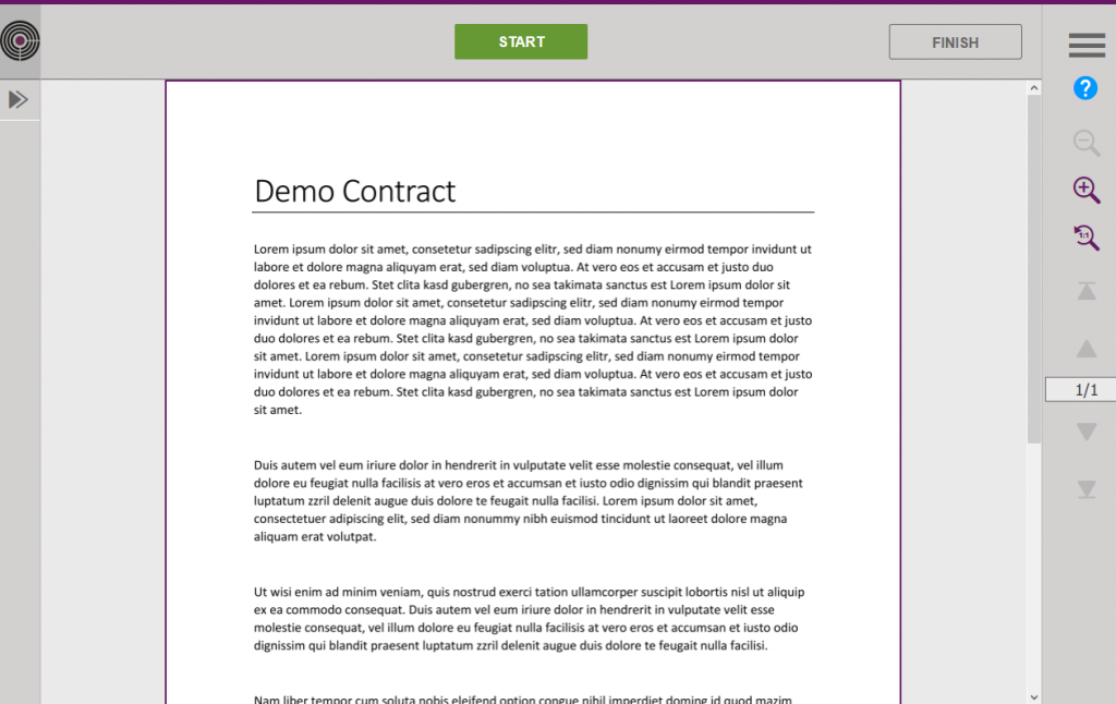
Comparison of the Viewer versions
| ||||||||||||||


| Section |
|---|
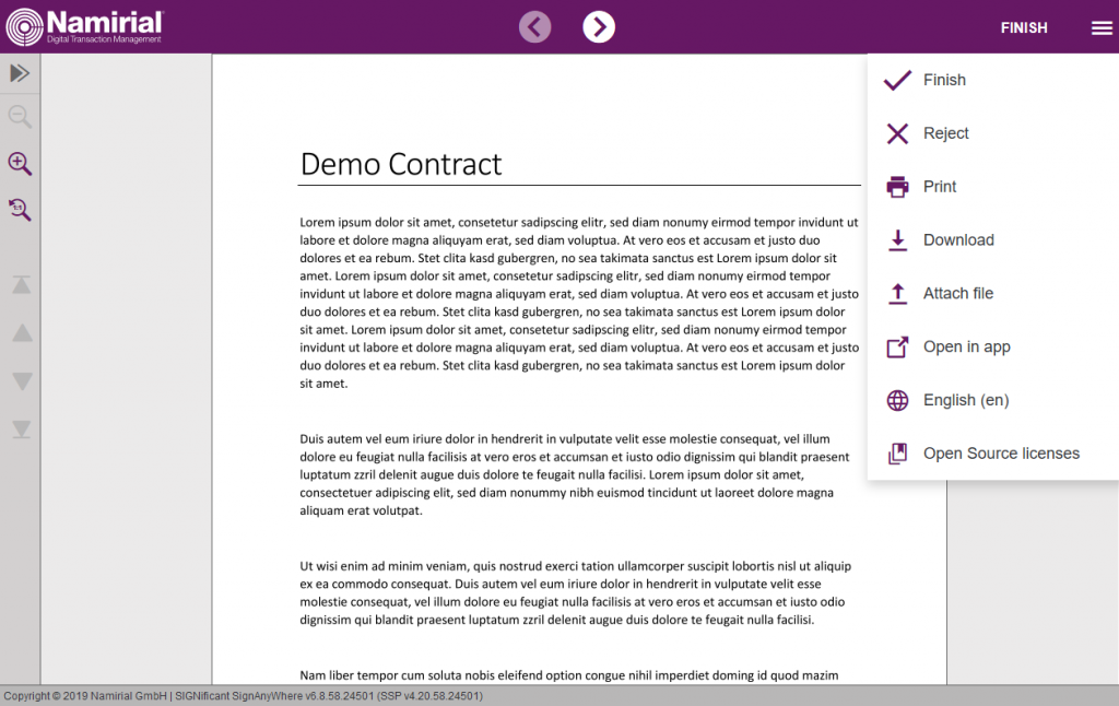
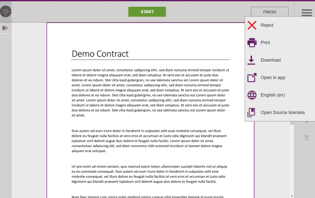
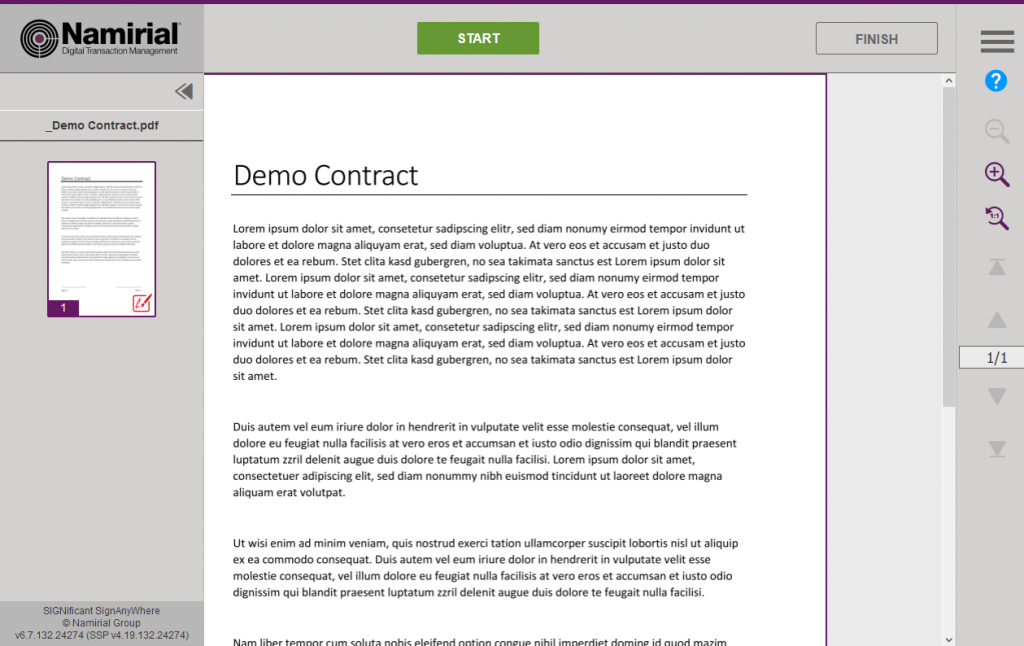
CustomizationDue the new layout of the viewer it also affects the customization of it (e.g. there is only one logo anymore required). We integrated a automatic migration of the customization, nevertheless, it is recommended to test the customization before upgrading the system. Moreover, if you are using a custom.css, please verify the customization before upgrading your system (private SaaS or on premise). Shared SaaS customer is recommended to test their customization on our demo plattform, before the shared SaaS instance gets upgraded. Contact your Namirial consultant or our support for more details. |
...
| Section |
|---|
Changes in the CustomizationThe following list should be used for a better understanding of
|
| Section | |||||||||||||||||||||||||||||||||||||||||||||||||||||||||||||||||||||||||||
|---|---|---|---|---|---|---|---|---|---|---|---|---|---|---|---|---|---|---|---|---|---|---|---|---|---|---|---|---|---|---|---|---|---|---|---|---|---|---|---|---|---|---|---|---|---|---|---|---|---|---|---|---|---|---|---|---|---|---|---|---|---|---|---|---|---|---|---|---|---|---|---|---|---|---|---|
|
| Section |
|---|
Automatic Migration LogicThe customization gets automatically migrated to the new viewer during the upgrade by the following rules:
|
...