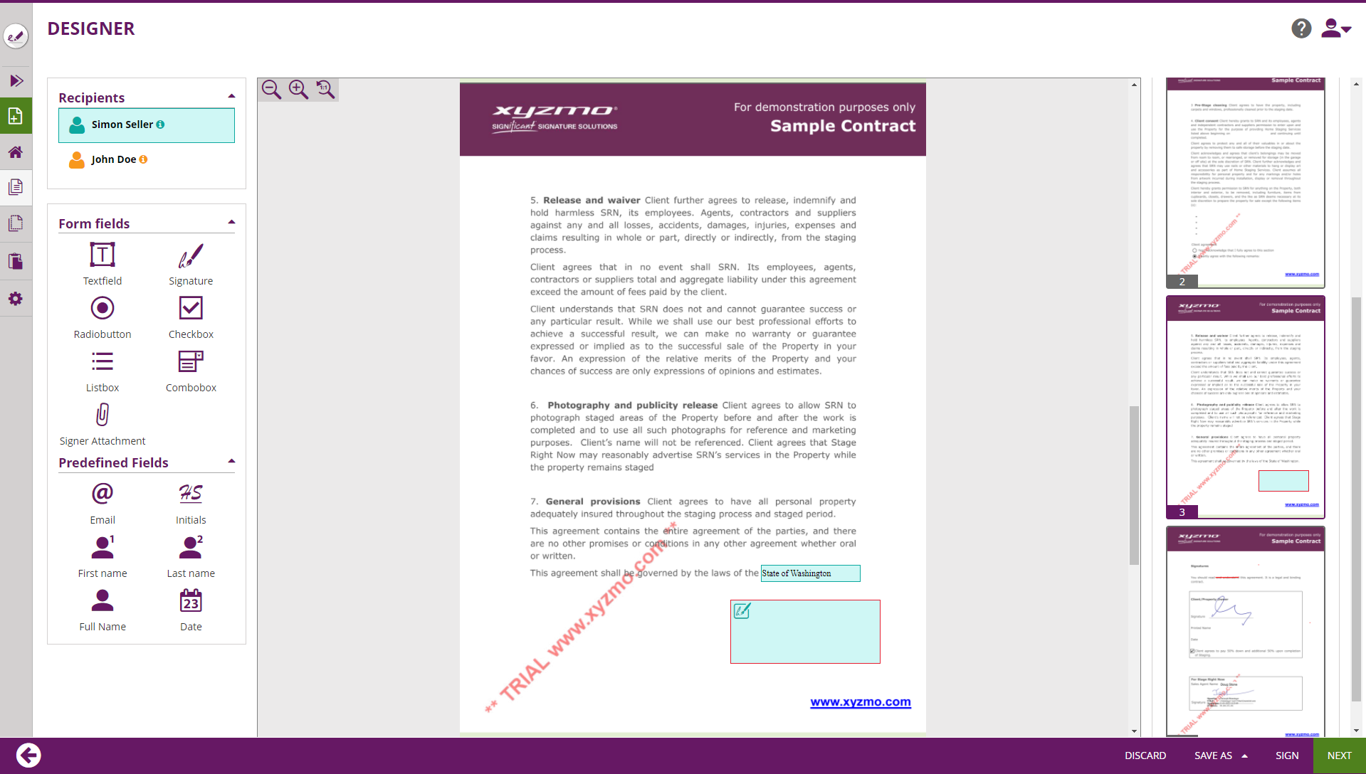
The designer page shows all formerly added (or recognized) interactive fields on the documents and allows to interactively place additional interactive fields.
Please see the following figure for more information.
| Figure | Description |
|---|---|
|
...
|
...
|
...
Properties Panel |
...
This documentation covers the following topics in the next chapters:
| Table of Contents | ||
|---|---|---|
|
UI Areas of the Designer explained in Detail
In this chapter, we are explaining the UI elements and their behavior in detail. We are not covering
Recipients List
Shows the list of all recipients and automatic-signature activities.
Allows to select to which recipient elements that are added later-on are assigned, and can be used to re-assign the element currently selected in the Main Editor.
Elements Toolbox
Form Field Elements
Predefined (static value) Fields
The value of a predefined field will be inserted automatically at the time when the recipient, to whom a predefined field was assigned, is opening the activity. Following predefined fields can be used:
- Email, which is the recipient email of the involved signer
- Initials, which is the combination of the first letters of the first name and the last name (Example: For the recipient "John Doe", the initials are "J D")
- First name, which is the first name of the recipient as defined by the sender on the Recipients Page
- Last name, which is the last name of the recipient as defined by the sender on the Recipients Page
- Full Name, which is the combination of the full first name and last name.
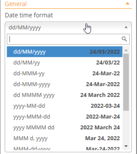
Note, especially in international context, that the current implementation today always lists the first name (given name) first, and the last name (surname) as second. - Date, which is the date when the activity was opened by the signer.
Read more about configuring the date format in the properties chapter below.
Main Editor
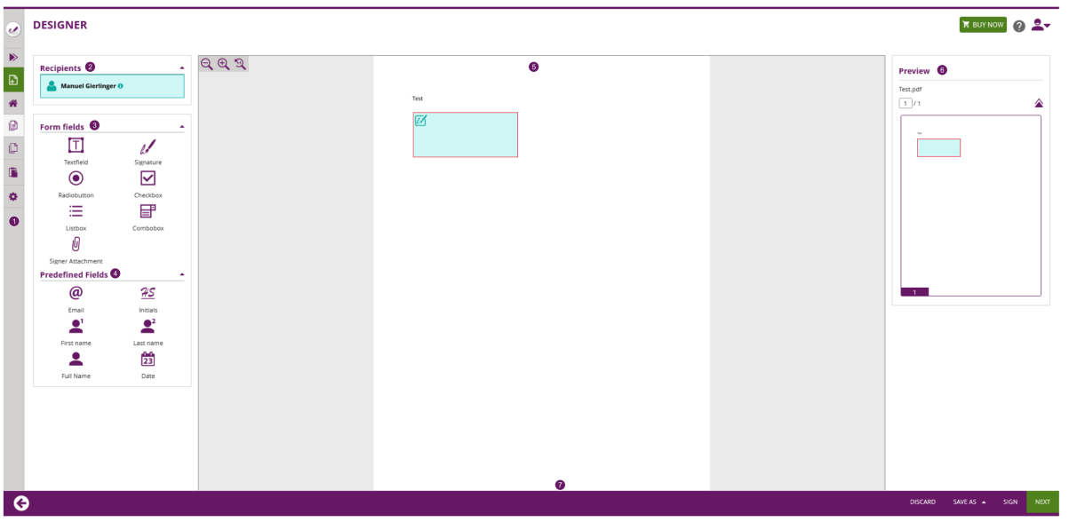
What-you-see-is-what-you-get (WYSIWYG) editor to place form elements, re-arrange and resize them. Elements can be added on the document by dragging them from the Elements Toolbox and placing it directly at the target location. After adding the element to the document, when moving the mouse over the element on the document, an in-place action menu up shows up:
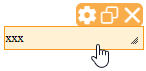
The in-place action menu provides following actions:
- The gearwheel opens the properties panel (which we describe in detail in one of the next chapters)
- The copy button allows to duplicate an element. The created duplicate is located at the same position and has to be moved to another position after pressing the copy button.
- The delete button (which is available only on elements inserted using the designer, or detected during document parsing when based on advanced document tags or sig-string notation, but not those that had been embedded as AcroForm Elements on the PDF) allows to delete an interactive element.
Re-arranging elements on the page can again be done by Drag&Drop. While re-arranging elements, rulers which are automatically appearing during the re-arranging help to allign controls precisely: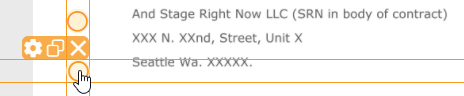
Elements can be resized with a Drag&Drop interaction on the lower-right corner (where it is indicated using the resize-corner icon). Note that elements that had been embedded as AcroForm Elements on the PDF cannot be resized.
Page Preview
Shows the structure of documents and their pages contained in the envelope, and previews locations of signature fields on the document.
Properties Panel
...
Wizard Navigation Bar
The navigation control of the wizard, with following buttons while on the Designer Page:
- Arrow-Back, navigates to the recipients page
- Discard, which deletes (after confirmation dialog) the draft
- Save-As
- Template, allowing to create a new Template based on the data configured for the Draft
- Draft, persisting the changes made on the draft and returning back to the Envelope Filter View.
- Sign-Button, visible and accessible only when the first signer of an envelope is the sender
- Next-Button, proceeds to the Summary Page
Element Properties
Let's have a deeper look into the properties of the elements which you can place using the Designer Page. When an element was placed on a document, and the element gets selected, the properties panel gets opened. Within the properties panel, different properties of the element can be defined. The properties which can be defined vary between different element types.
| Info |
|---|
Note that not all of the properties explained below are available on all instances or in all organizations. Some may require additional contractual agreements, may depend on instance configuration, or on Feature Flag configuration. In case you are missing a feature described below in your organization, and you need the functionality for your business case, get in contact with your Namirial Sales Representative or Technical Account Manager. |
General properties of all Elements
There is a couple of properties which can be defined on any interactive element thatcan be placed on a document:
The assignment of an element to a recipient defines which recipient is allowed to, or must, fill an element as part of fulfilling the (signing) activity. An element can be assigned to one (or no) recipient. Only recipients of type "signer" (with or without having signature fields) are eligible in the recipients selection (with an exception - "Automatic Signing Activities" can be selected on signature fields, see below). If a field is not assigned to any recipient, only the default value will be shown to all signers (and other recipients), but nobody will be able to interact with the element or change its value. When changing the recipient using the dropdown list, both the color indicator of the properties panel and the color of the element in the main panel will automatically change to the color indicator of the recipient (also visible e.g. in the recipients panel).
Only the recipient to whom an element was assigned will later-on be able to edit the value, but also all the other recipients in the signature workflow will see the value. Recipients that are involved in an activity before the signer is setting/editing the value see the field's default value (which might be empty or changed afterwards), while recipients that are involved after the signer see the value which the signer finally set.
Also, all elements support to define if an element is "required" or "optional". "Required" means that the user to whom an element is assigned must set a value (or keep the initial value), to ensure the element's value is not empty. Some field types like checkboxes may define different policies for handing the "required" property; we will explain details below in the properties section of the respective field types..
Properties of Textfield Elements
General Settings
In addition to the general properties of all elements, the textfield offers following additional properties:
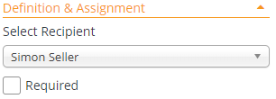
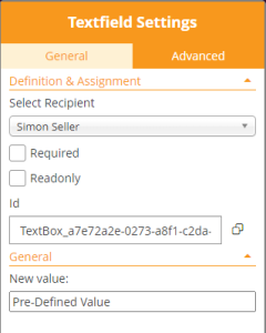
In the "Definition & Assignment" section:
- Readonly; when this property is checked the user cannot edit the value.
- Id; a (technical) field identifier which is typically used when the form values should be processed automatically after signing. Its use typically depends on integration scenarios.
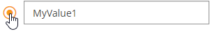
The control supports copying the value directly to the Windows clipboard, by pressing the "copy" icon ().
In the "General Section":
- Labeled as "New value", the initial value of the textfield element can be defined. This value will be shown to the recipients already before editing the value.
Advanced Settings
The "Advanced" tab contains Text & Appearance configuration and several options of the Textfield.
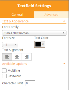
In the Text & Appearance section, the sender can define
- Font Family
- Font size
- Text color
- Text Alignment
The font family defines which font should be used for rendering the text in the web browser, and also be used for filling form elements in the PDF. Keep in mind when working with languages that require usage of Unicode characters, that the font installed on the server must also support the entire (used) unicode charset - otherwise the entire text or some characters will be represented using replacement characters.
In the "Available Options" section, the sender can define
- that a text field is accepting multiline input
- that the field behaves as a password field, which implies that the value entered by the recipient (or prefilled) is not readable but showing masked password input instead
- Define a maximum text input length (character limit)
Properties of Signature Elements
General Settings
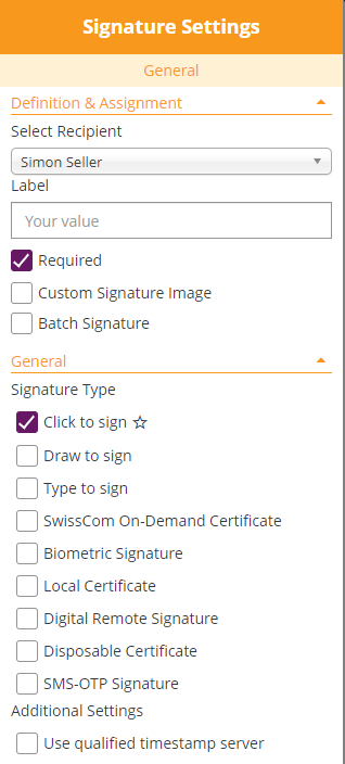
The "Definition & Assignment" section behaves like defined in the standard behavior of all elements, but with following deviations:
- Signature fields can be assigned also to "Automatic Signing Activities", making the automatic signatures visible on the document
- A "Batch Signature" option is added
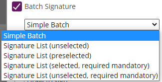
With the "Batch Signature" checkbox enabled, it makes the signature field a member of a batch of several signature fields. Signatures being member of a batch can be signed all at once if the signer prefers, but allow the signer also to sign them one by one. When the batch signing option is enabled, the sender can distinguish between different batch signing behavior:
- Simple Batch
where the signer just knows how many signature fields are signed as part of the batch - Signature List (unselected)
where a list of all signature fields (document name and page number, or signature field label) are displayed in a list of checkboxes; the user needs to select those which should be signed as part of the batch (opt-in) - Signature List (preselected)
where a list of all signature fields (document name and page number, or signature field label) are displayed in a list of checkboxes; the user needs can deselect those which he doesn't want to sign as part of the batch (opt-out) - Signature List (selected, required mandatory)
Like "preselected", but without an option to uncheck the "mandatory signature fields) - Signature List (unselected, required mandatory)
Like "unselected", but mandators signature fields still preselected and without an option to uncheck the "mandatory signature fields
The signature field, in the designer page's main editor, is represented by a different icon when the signature field is member of a batch:
...
...
Standard Menu Bar
- new Document: create a new document
- Home: to go back to the main page
- Documents: your (or our teams) sent documents and documents you have to sign
- Templates: your available templates
- Clipboard: if you install the MS Office Plugin (available in the menu top right), you are able to directly upload documents to MS Word to your clipboard in eSignAnyWhere.
- Settings: change your account or organization settings
For more information about the menu bar please also have a look at the Application Reference Web UI guide.
Recipients List
Shows the list of all recipients and automatic-signature activities.
Allows to select to which recipient elements that are added later-on are assigned, and can be used to re-assign the element currently selected in the Main Editor. Just switch between the recipients to assign the tasks for them.
Form Field Elements
| Info |
|---|
Please note: It is not possible to add any form fields other than signature fields to an already signed document. |
Let's have a deeper look into the properties of the elements which you can place using the Designer Page. When an element was placed on a document, and the element gets selected, the properties panel gets opened. Within the properties panel, different properties of the element can be defined. The properties which can be defined vary between different element types.
| Info |
|---|
Note that not all of the properties explained below are available on all instances or in all organizations. Some may require additional contractual agreements, may depend on instance configuration, or on Feature Flag configuration. In case you are missing a feature described below in your organization, and you need the functionality for your business case, get in contact with your Namirial Sales Representative or Technical Account Manager. |
General properties of all Elements
There is a couple of properties which can be defined on any interactive element that can be placed on a document:
The assignment of an element to a recipient defines which recipient is allowed to, or must, fill an element as part of fulfilling the (signing) activity. An element can be assigned to one (or no) recipient. Only recipients of type "signer" (with or without having signature fields) are eligible in the recipients selection (with an exception - "Automatic Signing Activities" can be selected on signature fields, see below). If a field is not assigned to any recipient, only the default value will be shown to all signers (and other recipients), but nobody will be able to interact with the element or change its value. When changing the recipient using the drop down list, both the color indicator of the properties panel and the color of the element in the main panel will automatically change to the color indicator of the recipient (also visible e.g. in the recipients panel).
Only the recipient to whom an element was assigned will later-on be able to edit the value, but also all the other recipients in the signature workflow will see the value. Recipients that are involved in an activity before the signer is setting/editing the value see the field's default value (which might be empty or changed afterwards), while recipients that are involved after the signer see the value which the signer finally set.
Also, all elements support to define if an element is "required" or "optional". "Required" means that the user to whom an element is assigned must set a value (or keep the initial value), to ensure the element's value is not empty. Some field types like checkboxes may define different policies for handing the "required" property; we will explain details below in the properties section of the respective field types..
Textfield
Following settings are available for textfields:
| General | Advanced |
|---|---|
|
|
Signature
For information about how to sign the different signature types please have a look at the Signer Guide.
For information about how to configure the signature types for a REST api call please have a look at: Beginner Guide
In the "General" section, the signer can select the signature type(s) he wants to allow for the signer. The different signature types are explained in detail in the Electronic Signature Guide (sender perspective). Also, the Signer Guide describes the different user experience from signer's perspective.
If the sender allows just one signature type, the signature type will be automatically selected when a recipient later-on clicks on the signature field. When allowing multiple signature types, the sender is allowing the recipient to select one of the allowed signature types. The sender can in addition define, by marking the "star" icon (), a preferred signature type which is then automatically preselected for the recipient.
In addition, the sender can define if a timestamp of a time-stamping service will be embedded on the signature directly.
The (RFC 3161 compliant) timestamp service therefore has to be configured in the server configuration. It depends on server configuration, if a qualified timestamp service will be used therefore.
Please see the following settings which are available for all signature fields:
The "Definition & Assignment" section behaves like defined in the standard behavior of all elements, but with following deviations:
- Signature fields can be assigned also to "Automatic Signing Activities", making the automatic signatures visible on the document
- Required
- Custom Signature Image (feature flag necessary: "ExternalSignatureImage"
- This allows signers to upload their picture (custom signature picture) and add it as additional graphics to the stamp imprint. Furthermore the signer can store the signature image which a gallery for later usage.
- Batch Signature
With the "Batch Signature" checkbox enabled, it makes the signature field a member of a batch of several signature fields. Signatures being member of a batch can be signed all at once if the signer prefers, but allow the signer also to sign them one by one. When the batch signing option is enabled, the sender can distinguish between different batch signing behavior:
- Simple Batch
where the signer just knows how many signature fields are signed as part of the batch - Signature List (unselected)
where a list of all signature fields (document name and page number, or signature field label) are displayed in a list of checkboxes; the user needs to select those which should be signed as part of the batch (opt-in) - Signature List (preselected)
where a list of all signature fields (document name and page number, or signature field label) are displayed in a list of checkboxes; the user can deselect those which she/he doesn't want to sign as part of the batch (opt-out) - Signature List (selected, required mandatory)
Like "preselected", but without an option to uncheck the "mandatory signature fields) - Signature List (unselected, required mandatory)
Like "unselected", but mandators signature fields still preselected and without an option to uncheck the mandatory signature fields
- Simple Batch
The signature field, in the designer page's main editor, is represented by a different icon when the signature field is member of a batch:
Signature Field in standard representation Signature Field allowing batch signing
ClickToSign
| Info |
|---|
Please note: The additional setting for using qualified timestamp server is not available for this signature type. There is neither an additional configuration (setting) nor a feature flag needed for this signature type. |
This is the simplest signature type, with the most convenient user experience. With this signature type the signer has just to click on the signature field to sign. As it is a pure browser-based signing experience, we consider the "ClickToSign" signature type as one of the "HTML5 signature types". This requires careful consideration of configuration of the activity to reach the necessary expression of power.
DrawToSign
| Info |
|---|
Please note: The additional setting for using qualified timestamp server is not available for this signature type. There is neither an additional configuration (setting) nor a feature flag needed for this signature type. |
This type allows the signer to draw his signature by mouse, finger or pen. Just an image of his signature is created and embedded into the document. In this case, only the flat picture of the signature and technical parameters of the session are recorded, but no biometric data. We consider also the "DrawToSign" signature type as one of the "HTML5 signature types".
TypeToSign
| Info |
|---|
Please note: The additional setting for using qualified timestamp server is not available for this signature type. There is neither an additional configuration (setting) nor a feature flag needed for this signature type. |
With this type the signer has to type in his name to sign the signature field. The signature itself is printed in a computer font that may look like someone's handwriting, but actually isn't the signer's handwriting itself. It's the third and last one of this guide which we consider as one of the "HTML5 signature types".
SwissCom On Demand Certificate
| Info | |||||||||||||
|---|---|---|---|---|---|---|---|---|---|---|---|---|---|
Following feature flag is necessary: SwissComOnDemandCertificate Before starting the envelope please see the following configurations which are needed in order to send a SwissCom On Demand Certificate.
After setting the organization configuration you can start with the envelope. Please do not forget to add the following data which is necessary to use the SwissCom On Demand Certificate:
|
Biometric Signature
| Info |
|---|
Following feature flag is necessary: BiometricSignature |
For the biometric signature you can additionally configure following setting:
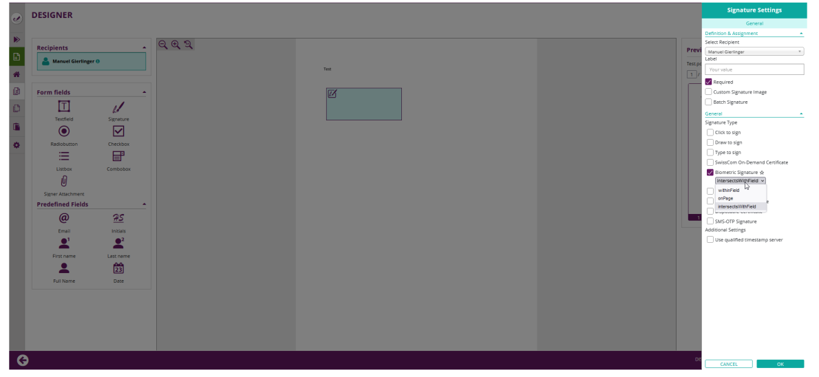
- positioning
- intersects with field
- withinField
- onPage
Local Certificate
With the local certificate the signer can use a locally on his/her device installed certificate for signing.
| Info | ||||
|---|---|---|---|---|
Please see the following configuration available for local certificate signature:
|
Digital Remote Signature
If the user has a long lived certificate you can use the Digital Remote Signature option. You can configure the User Id and the Device Id. If not configured the signer must provide those information:
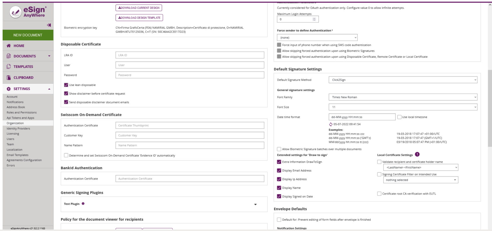
Disposable Certificate
| Info |
|---|
Following feature flag is necessary: DisposableCertificate |
Please see the following configuration for the disposable certificate (those settings can be found in the organization settings)
| Figure | Configuration |
|---|---|
|
|
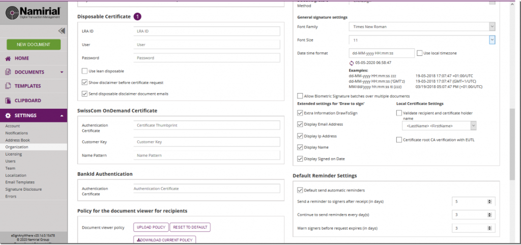
After the configuration in the organization settings you also have to fill in the disposable data for the recipient. Please see the next figure:
| Figure | Configuration |
|---|---|
|
The signer will receive its email as usual and when the signer wants to sign a disposable certificate signature field he will get a one-time-password via SMS. The counter on the disposable certificate starts by signing the first signature. If “Show disclaimer before certificate request” is enabled in Settings->Organization->Disposable Certificate the signer first receives the disclaimer before the SMS-OTP. When the document is finished you can validate, for example, the qualified electronic signature in Adobe Reader.
SMS-OTP Signature
Following configuration (optional) can be set before sending the envelope with a SMS-OTP signature: You can either set the phone number for the signer or not. To set the phone number just add in the following space on the create envelope page. If you do not set the phone number, the signer has to fill in his/her phone number:
Automatic Remote Signature
| Info |
|---|
Following feature flag is necessary: AutomaticRemoteSignature |
If you create a workflow, a new type “Add Automatic” recipient is available. The automatic remote signature / eSealing is applied automatically to the document, if it is the automatic recipient turn. The workflow continues automatically with the next recipient after the automatic recipient.
- Automatic Remote Signatures / eSealing are an optional eSignAnyWhere feature
- User Managers can configure the automatic remote signature / eSealing profiles in the Organization settings page, when they have enabled the user option “Allow Automatic eSealing”
- Power use can use the automatic remote signature / eSealing profiles, if they have the user option “Allow Automatic eSealing” enabled
1) Automatic Remote Signature Profiles
The profiles for automatic remote signatures are managed via the organization’s settings page (so only by user managers). For creating an automatic remote signature profile you need a description (e.g. name), the username and the password.
Attention: if a power user wants to use the automatic remote signatures, the user must have enabled the user right “” (see “Settings” > “Users”).
2) User Settings
User must have enabled the option “Allow automatic eSealing” to use the automatic remote signatures / eSealing within a workflow.
|
3) Creating a workflow with automatic remote signatures
In the eSAW UI you can add an automatic signer / eSealing via button in the recipient list “Add Automatic”. Then the profile must be selected for the automatic signature / eSealing. Attention: the power user must have the right “Allow automatic eSealing” enabled (see “Settings” > “Users”).
|
Generic Signing Plugin
| Info |
|---|
| Note: This feature is not available with basic subscription, so please contact your Namirial sales. |
The “Generic Signing Plugin” (GSP) allows implementation of custom 3rd party signature creation implementations (HSM based, web service based, etc). It is typically used to integrate external CAs into eSignAnyWhere. A GSP based implementation of a 3rd party CA is available for envelopes created via eSAW API or via eSAW WebUI. New features and improvements allow wider usage of the GSP.
You can find the configuration for a generic signing plugin in the organization settings. After those configurations you can use the generic signing plugin.
Radiobutton
Following settings are available for a radio button:
| General |
|---|
|
Checkbox
| General |
|---|
|
Listbox
| General | Advanced |
|---|---|
|
|
Combobox
| General | Advanced |
|---|---|
|
|
Signer Attachment
| General |
|---|
|
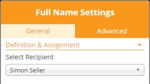
Predefined (static value) Fields
The value of a predefined field will be inserted automatically at the time when the recipient, to whom a predefined field was assigned, is opening the activity. On predefined fields, only the recipient can be selected. Different to other form elements, it is not possible to set a predefined field "mandatory" as the value anyhow is filled automatically. Following predefined fields can be used:
| Predefined field | Description |
|---|---|
| Is the recipient email of the involved signer | |
| Initials | Is the combination of the first letters of the first name and the last name (Example: For the recipient "John Doe", the initials are "J D") |
| First name | Is the first name of the recipient as defined by the sender on the Recipients Page |
| Last name | Is the last name of the recipient as defined by the sender on the Recipients Page |
| Full Name | Is the combination of the full first name and last name. |
| Date | Is the date when the activity was opened by the signer. |
Following settings apply for:
- Initials
- First name
- Last name
- Full name
| General | Advanced |
|---|---|
|
|
Following settings apply only for date:
| General | Advanced |
|---|---|
|
|
Main Editor
What-you-see-is-what-you-get (WYSIWYG) editor to place form elements, re-arrange and resize them. Elements can be added on the document by dragging them from the Elements Toolbox and placing it directly at the target location. After adding the element to the document, when moving the mouse over the element on the document, an in-place action menu up shows up:
The in-place action menu provides following actions:
- The gearwheel opens the properties panel (which we describe in detail in one of the next chapters)
- The copy button allows to duplicate an element. The created duplicate is located at the same position and has to be moved to another position after pressing the copy button.
- The delete button (which is available only on elements inserted using the designer, or detected during document parsing when based on advanced document tags or sig-string notation, but not those that had been embedded as AcroForm Elements on the PDF) allows to delete an interactive element.
Re-arranging elements on the page can again be done by Drag&Drop. While re-arranging elements, rulers which are automatically appearing during the re-arranging help to align controls precisely:
Elements can be resized with a Drag&Drop interaction on the lower-right corner (where it is indicated using the resize-corner icon). Note that elements that had been embedded as AcroForm Elements on the PDF cannot be resized.
Page Preview
Shows the structure of documents and their pages contained in the envelope, and previews locations of signature fields on the document.
Wizard Navigation Bar
The navigation control of the wizard, with following buttons while on the Designer Page:
- Arrow-Back, navigates to the recipients page
- Discard, which deletes (after confirmation dialog) the draft
- Save-As
- Template, allowing to create a new Template based on the data configured for the Draft
- Draft, persisting the changes made on the draft and returning back to the Envelope Filter View.
- Sign-Button, visible and accessible only when the first signer of an envelope is the sender
- Next-Button, proceeds to the Summary Page
Properties Panel
On devices without touch capabilities, the user can open the properties panel by selecting (clicking) an element in the Main Editor area. On tablet PCs (or in general on devices with touch input), the user must click on the cogwheel icon on an element's adhoc menu to open the properties panel. The color of the property panel is indicating to which recipient an element is assigned. The recipient colors used in the recipients list, and also used for the elements in the main editor, are reflected in the colors of the properties panel. When the properties panel is open, the user can change settings, but needs to confirm or cancel the properties panel using one of the two buttons at the bottom of the properties panel, before other UI changes (e.g. arranging of elements) can be done in the UI:
In the "General" section, the signer can select the signature type(s) he wants to allow for the signer. The different signature types are explained in detail in the Electronic Signature Guide (sender perspective). Also, the Signer Guide describes the different user experience from signer's perspective.
If the sender allows just one signature type, the signature type will be automatically selected when a recipient later-on clicks on the signature field. When allowing multiple signature types, the sender is allowing the recipient to select one of the allowed signature types. The sender can in addition define, by marking the "star" icon (), a preferred signature type which is then automatically preselected for the recipient.
In addition, the sender can define if a timestamp of a timestamping service will be embedded on the signature directly.
The (RFC 3161 compliant) timestamp service therefore has to be configured in the server configuration. It depends on server configuration, if a qualified timestamp service will be used therefore.
Properties of Radiobutton Elements
General Settings
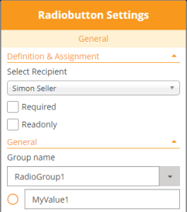
In addition to the general properties of all elements, the radiobutton element offers following additional properties:
In the "Definition & Assignment" section:
- Readonly; when this property is checked the user cannot edit the value.
In the "General Section":
- Selection of the Radio Button Group to which an element belongs;
this dropdown list is editable and allows to assign the Radiobutton to an existing group by selecting it from the list, or to create a new Radiobutton Group just by entering a name which is not yet in use. - The value of the selected Radiobutton element; this value is typically used in integration scenarios where form values are automatically processed after signing.
- The Radiobutton which should be preselected in a Radiobutton group can be selected by clicking the radiobutton preview (circle) in the properties panel:
Properties of Checkbox Elements
General Settings
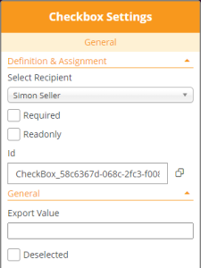
In addition to the general properties of all elements, the checkbox element offers following additional properties:
In the "Definition & Assignment" section:
- Readonly; when this property is checked the user cannot edit the value.
- Id; a (technical) field identifier which is typically used when the form values should be processed automatically after signing. Its use typically depends on integration scenarios.
The control supports copying the value directly to the Windows clipboard, by pressing the "copy" icon (
In the "General Section":
- An "export value", which is the meaning assigned to the checkbox when it is checked. Using this field might be indicated when form values should be processed automatically after signing. Its use typically depends on integration scenarios.
- The initial value of the checkbox element; while the label automatically changes between "Deselected" and "Selected" in the current implementation to reflect its current state.
Properties of Predefined Fields
On predefined fields, only the recipient can be selected. Different to other form elements, it is not possible to set a predefined field "mandatory" as the value anyhow is filled automatically.
On the predefined date field, it is possible to select, from a predefined list of supported date formats, the format which should be used to render the date information: